Wednesday, May 30, 2012

Scary Signs, Literal Interpretations, and Bad Mail!

Well, I have my final projects for the school year.  I may update more over the summer, but for now, here they are!  First up is a scary sign.

He just wants to play tag!
This project turned out quite nicely.  Although some parts took some working, everything worked out nicely.  The most difficult part was editing the text on the sign.  If I re-did this project with more time, I'd find another child to edit into a zombie.  This project didn't really teach me anything new, but it was fun.

Next, we had to make a few "literal interpretations" of some compound words, so I did three.  Here they are!

Bullfrog

Knucklehead

Butterball
I'll make this quick: I think they're all pretty good, and everything worked as planned, but I'd make the butterball looked more realistic in a redo.  It was tough finding good sources for the bullfrog, but everything else was fine.  I didn't learn anything new.

Finally, my last project of the year.  We were to make a piece of "bad mail," so I decided to make a special package that opens itself.

You should make use of it.  After all, the shipping expenses from Hell to here are NOT cheap.
I'd say this is one of my best projects of all year.  It has multiple elements to it, and I think all of them are done well, having worked exactly as I wanted them to.  It was difficult to make the burn look realistic, but it definitely worked out well.  There is nothing I would change if I re-did this project.  I learned nothing new except how to make an awesome project.

And that's my last project for the school year!  I'll see if I can do video stuff and post it here over the summer.  Thanks for watching my blog!

Body Part Swap, Motion Project, and Cougaroo!

I have my next three projects for today!  First up is my body part mix-up project.

The biggest question this picture raises: "Where's his nose?"
 I am highly entertained by how this project turned out.  The tools were still working well for me, and there wasn't much difficulty involved.  I don't know what I would change if I re-did this project.  Maybe make the indentations in the part where the eyes are SUPPOSED to be less obvious.  Since I had used everything involved with this project before, I didn't really learn anything new.

Next is my motion project.

It's the boomerang from The Legend of Zelda: Twilight Princess.
I'm alright with this one.  The techniques worked as I wanted them to, and the only real difficult part was getting a good curved blurred portion.  If I were to redo this project, I would probably make more translucent copies.  This project taught me how to make something look like it's in motion.

Finally, we were tasked with making a "cougaroo" in some manner, so I decided to make another newimal.

It doesn't really look like it'll make it...
This is a pretty good project in my opinion.  Once again, the elements worked as planned.  The difficult part was getting a picture of a cougar and a kangaroo that blended well together.  If I re-did the project, I would probably make the colors of the two halves a little more similiar.  Again, this was a project that I had done something similar to before, so I didn't learn anything new.  However, I did decide to make an alternate version:


Yeah, I had to.  See you all soon!

Tuesday, May 29, 2012

Disney Superhero, Movie Poster, and Masking!

Okay, I have a BUNCH of projects to post on here, so I'll just do them three at a time.  First is the assignment in which we had to combine a Disney character with a superhero or superpower.
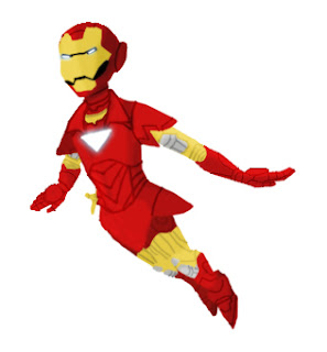
Behold: Iron Pan.
Iron Pan turned out quite well.  Everything worked, and there wasn't anything too difficult.  If I re-did it, I would add a background and repulsor effects, and probably take more time on getting the lighting right.  While doing this project, I learned how to re-draw a source in a different form.

Our next assicnment was to make a movie poster that was "different."  After much image searching, I finally found what I needed to make this:
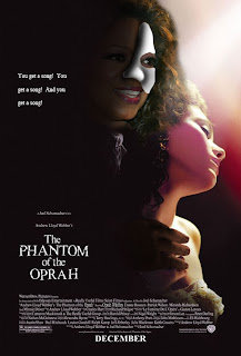
Well, she has to make even more money somehow.

I wasn't the only one who liked this project, according to my classmates.  I made everything work out, and, again, it wasn't too difficult.  I would probably re-do the hand were I to remake this project.  This project taught me that I can be funny sometimes.

Finally, we had to experiment with masking, which is hiding parts of an image from view.  I used masking to make this picture:
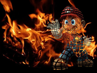

....I honestly can't think of a caption.
The fact that I can't think of a caption doesn't mean that I don't like the project.  I'm actually very proud of it.  Everything worked as it was supposed to, except for the fact that I completely messed it up the first time through without realizing and had to re-do most of it.  If I re-did this project, I would make sure I got all the lines to follow the contours as I wanted to instead of them being all scribbly- oh wait, that IS what happened.  Anyway, I learned about masks while doing this project.

Well, that's it for this round.  More coming up soon!

Monday, May 14, 2012

Hound Dog and Banana Slug

I've got two new projects to show you all!  The first is a lip-syncing project made in Flash!


His voice is beautiful...

I know I normally say this a lot, but I am REALLY happy with this project.  Every aspect worked quite well in my opinion.  However, while no individual aspect was really difficult, going over the photos taken of my mouth to look like the mouth of a dog was quite tedious.  If I were to do this project over again, I would make the mouth more simplistic so I could draw it faster so less time would be spent on that so I could've had time to look up how to make the dog move and change backgrounds like I wanted to.  Ah well.

Next up is my slice project, for which we had to take a slice out of an animal or object to reveal something different on the inside.  I chose to do a banana slug.  Guess what it was made out of.


No, seriously, guess.  I can wait.


Did you guess yet?  Well, let's see....


Yep.  -5 creativity points for that, but I gained +1 in pun-making XP.

Yes, it is a banana slug made out of a banana.  Terrible puns aside, I'm pretty happy with this picture.  I was able to get everything that I wanted to do to work, and there wasn't really anything difficult aside from finding a good picture of a banana slice to use.  I also wanted to put it on a cutting board due to Mr. Sands' suggestion of doing so, but I couldn't find a good-sized picture of one. *shrug* If I did this project over again, I would probably improve the drop shadow on the banana slice a little bit and give more effort into finding a cutting board picture.  This project taught me how to use perspective to make something fit the picture more.

Well, that's it for now.  Stay tuned for scenes from the next "General Hosp- Uh, I mean, new post coming soon.

Sunday, May 6, 2012

Cinemagraph and Parts Project!

Okay, time to get my latest projects out of the way.  Here's my cinemagraph!

Just me sitting alone, thinking about stuff...
I think this project is really neat.  My slightly translucent motion effect worked exactly as I wanted it to, as did everything else.  However, it was kinda difficult to cut out the moving part of the frames efficiently.  If I re-did this project, I would adjust the masking near the foot more so it doesn't cut into the shadow of the woman.  In doing this project, I learned how to create gifs in Photoshop- my previous gif was made with Flash.

And here's my two versions of my parts project.

Here's the normal version....


And the colorized version!

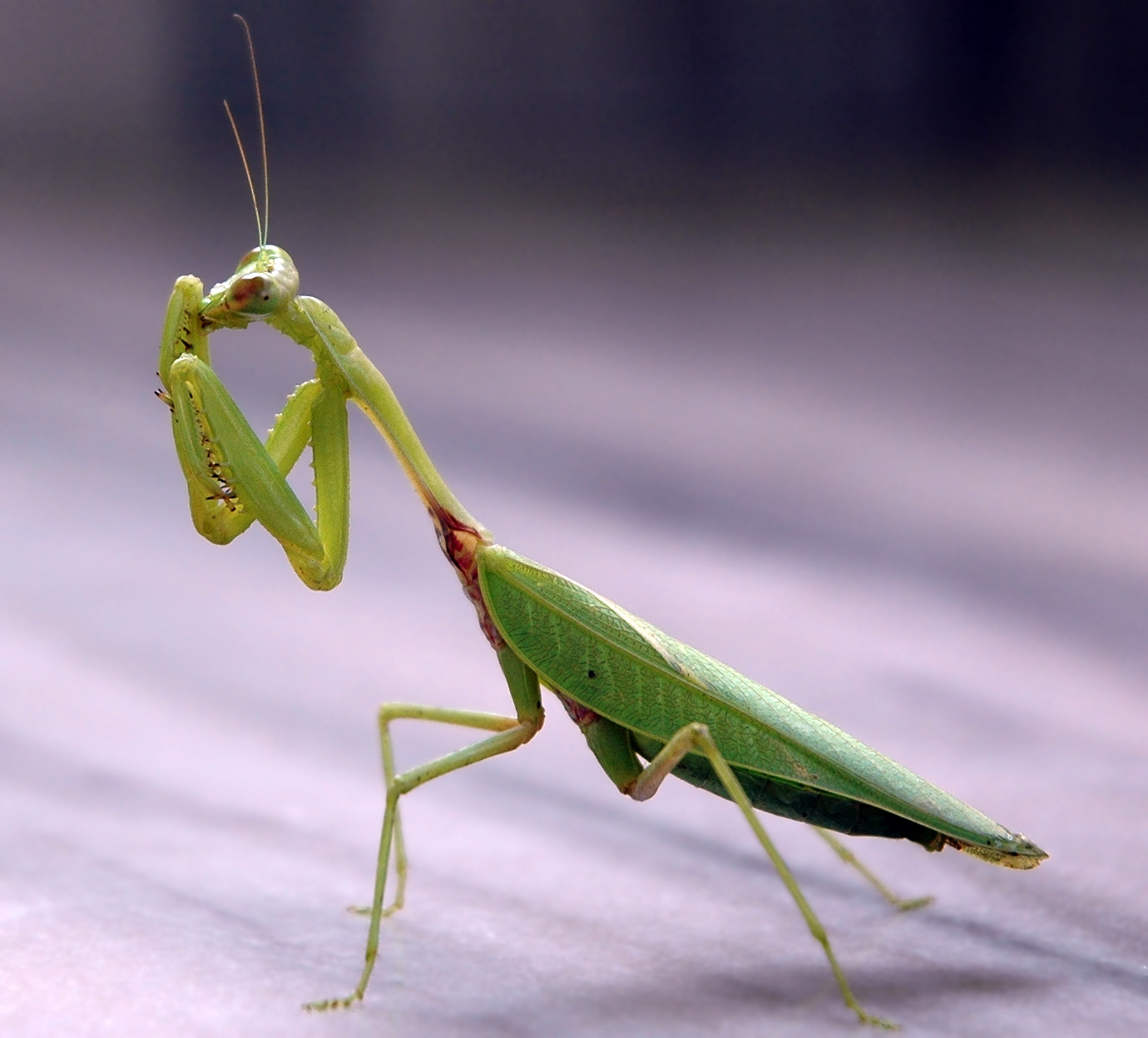
Here's the original picture.
This is another project I'm really proud of.  It took some working, but all the pieces worked quite well for me.  That, however, was the tough part- finding parts to make up the mantis.  If I re-did this project, I'm honestly not sure what I would do.  I'd maybe try to find parts that all fit into a certain theme, but really, that'd be really difficult.  This project taught me how to see many items in one object and how to arrange them accordingly.

Friday, April 13, 2012

Blend Tool!

I've already finished a project and have it ready for a post!  Our task was to look up an Adobe Illustrator tutorial for beginners, follow it, and post the result.  My tutorial was on the Blend tool.  Here's the tutorial:

http://vector.tutsplus.com/tutorials/tools-tips/illustrators-blend-tool-a-comprehensive-guide/

It doesn't explicitly give you a tutorial on what to do; rather, it teaches you of all the applications of the Blend tool.  I used these to create this City at Sunset!

I hope that's the Sun's path and not just multiple Suns.
I really like this picture.  It's really smooth, and the Blend tool worked quite well.  The most difficult part was trying to manage the Sun so it looked good.  If I re-did this, I'd try to manage the highlights on the buildings more.  This project taught me how to use the Blend tool, obviously.

I think the tutorial was pretty good.  It didn't exactly explain how to use each function explicitly, but the pictures helped figure out what function of the tool did what.  I think this tutorial would be good to use in the future.

Thursday, April 12, 2012

Animation and Illustrator!

I return with three new projects done in my computer art class, all of which I really like!  First off, I have my first animation- a walk cycle- in the form of a gif!

Click on the picture for the full-size, better quality version!
I'm really happy with this project.  The animation is really smooth, and everything worked as I wanted it to.  The most difficult part was adjusting each of the original four frames to be like its inverse frame.  If I re-did the project, I'd make it so the jacket and pants are separate so it doesn't look like he's in a onesie.  This project helped me learn how to make gifs in Flash.

Next, we created gradient flowers in Illustrator, a program that uses vector images rather than pixels.  I decided to give mine stems and a background!

Ooh, pretty....
I think I did quite well on this project.  As usual, everything worked fine, and the only difficult part was learning how to export just what was inside the image frame.  If I re-did the project, I may add some clouds in the background.  Doing this project helped me learn how to use the bloat and pucker tools in Illustrator.

Finally, I have a duck that I traced with the pen tool in Illustrator!

♪ Rubber ducky, you're the one... ♪

Again, I think this one turned out well.  Everything I tried to do worked out well.  It was a little difficult adjusting the shapes to look good.  I would probably make the sun more clear if I re-did this project.  In all honesty, I didn't learn anything from doing this project, since I already knew how to use the pen tool from having used it to make the stems in my flower.

Thanks for watching my blog!  Stay tuned for the next update!