Wednesday, May 30, 2012

Scary Signs, Literal Interpretations, and Bad Mail!

Well, I have my final projects for the school year.  I may update more over the summer, but for now, here they are!  First up is a scary sign.

He just wants to play tag!
This project turned out quite nicely.  Although some parts took some working, everything worked out nicely.  The most difficult part was editing the text on the sign.  If I re-did this project with more time, I'd find another child to edit into a zombie.  This project didn't really teach me anything new, but it was fun.

Next, we had to make a few "literal interpretations" of some compound words, so I did three.  Here they are!

Bullfrog

Knucklehead

Butterball
I'll make this quick: I think they're all pretty good, and everything worked as planned, but I'd make the butterball looked more realistic in a redo.  It was tough finding good sources for the bullfrog, but everything else was fine.  I didn't learn anything new.

Finally, my last project of the year.  We were to make a piece of "bad mail," so I decided to make a special package that opens itself.

You should make use of it.  After all, the shipping expenses from Hell to here are NOT cheap.
I'd say this is one of my best projects of all year.  It has multiple elements to it, and I think all of them are done well, having worked exactly as I wanted them to.  It was difficult to make the burn look realistic, but it definitely worked out well.  There is nothing I would change if I re-did this project.  I learned nothing new except how to make an awesome project.

And that's my last project for the school year!  I'll see if I can do video stuff and post it here over the summer.  Thanks for watching my blog!

Body Part Swap, Motion Project, and Cougaroo!

I have my next three projects for today!  First up is my body part mix-up project.

The biggest question this picture raises: "Where's his nose?"
 I am highly entertained by how this project turned out.  The tools were still working well for me, and there wasn't much difficulty involved.  I don't know what I would change if I re-did this project.  Maybe make the indentations in the part where the eyes are SUPPOSED to be less obvious.  Since I had used everything involved with this project before, I didn't really learn anything new.

Next is my motion project.

It's the boomerang from The Legend of Zelda: Twilight Princess.
I'm alright with this one.  The techniques worked as I wanted them to, and the only real difficult part was getting a good curved blurred portion.  If I were to redo this project, I would probably make more translucent copies.  This project taught me how to make something look like it's in motion.

Finally, we were tasked with making a "cougaroo" in some manner, so I decided to make another newimal.

It doesn't really look like it'll make it...
This is a pretty good project in my opinion.  Once again, the elements worked as planned.  The difficult part was getting a picture of a cougar and a kangaroo that blended well together.  If I re-did the project, I would probably make the colors of the two halves a little more similiar.  Again, this was a project that I had done something similar to before, so I didn't learn anything new.  However, I did decide to make an alternate version:


Yeah, I had to.  See you all soon!

Tuesday, May 29, 2012

Disney Superhero, Movie Poster, and Masking!

Okay, I have a BUNCH of projects to post on here, so I'll just do them three at a time.  First is the assignment in which we had to combine a Disney character with a superhero or superpower.

Behold: Iron Pan.
Iron Pan turned out quite well.  Everything worked, and there wasn't anything too difficult.  If I re-did it, I would add a background and repulsor effects, and probably take more time on getting the lighting right.  While doing this project, I learned how to re-draw a source in a different form.

Our next assicnment was to make a movie poster that was "different."  After much image searching, I finally found what I needed to make this:

Well, she has to make even more money somehow.

I wasn't the only one who liked this project, according to my classmates.  I made everything work out, and, again, it wasn't too difficult.  I would probably re-do the hand were I to remake this project.  This project taught me that I can be funny sometimes.

Finally, we had to experiment with masking, which is hiding parts of an image from view.  I used masking to make this picture:


....I honestly can't think of a caption.
The fact that I can't think of a caption doesn't mean that I don't like the project.  I'm actually very proud of it.  Everything worked as it was supposed to, except for the fact that I completely messed it up the first time through without realizing and had to re-do most of it.  If I re-did this project, I would make sure I got all the lines to follow the contours as I wanted to instead of them being all scribbly- oh wait, that IS what happened.  Anyway, I learned about masks while doing this project.

Well, that's it for this round.  More coming up soon!

Monday, May 14, 2012

Hound Dog and Banana Slug

I've got two new projects to show you all!  The first is a lip-syncing project made in Flash!


His voice is beautiful...

I know I normally say this a lot, but I am REALLY happy with this project.  Every aspect worked quite well in my opinion.  However, while no individual aspect was really difficult, going over the photos taken of my mouth to look like the mouth of a dog was quite tedious.  If I were to do this project over again, I would make the mouth more simplistic so I could draw it faster so less time would be spent on that so I could've had time to look up how to make the dog move and change backgrounds like I wanted to.  Ah well.

Next up is my slice project, for which we had to take a slice out of an animal or object to reveal something different on the inside.  I chose to do a banana slug.  Guess what it was made out of.


No, seriously, guess.  I can wait.


Did you guess yet?  Well, let's see....


Yep.  -5 creativity points for that, but I gained +1 in pun-making XP.

Yes, it is a banana slug made out of a banana.  Terrible puns aside, I'm pretty happy with this picture.  I was able to get everything that I wanted to do to work, and there wasn't really anything difficult aside from finding a good picture of a banana slice to use.  I also wanted to put it on a cutting board due to Mr. Sands' suggestion of doing so, but I couldn't find a good-sized picture of one. *shrug* If I did this project over again, I would probably improve the drop shadow on the banana slice a little bit and give more effort into finding a cutting board picture.  This project taught me how to use perspective to make something fit the picture more.

Well, that's it for now.  Stay tuned for scenes from the next "General Hosp- Uh, I mean, new post coming soon.

Sunday, May 6, 2012

Cinemagraph and Parts Project!

Okay, time to get my latest projects out of the way.  Here's my cinemagraph!

Just me sitting alone, thinking about stuff...
I think this project is really neat.  My slightly translucent motion effect worked exactly as I wanted it to, as did everything else.  However, it was kinda difficult to cut out the moving part of the frames efficiently.  If I re-did this project, I would adjust the masking near the foot more so it doesn't cut into the shadow of the woman.  In doing this project, I learned how to create gifs in Photoshop- my previous gif was made with Flash.

And here's my two versions of my parts project.

Here's the normal version....


And the colorized version!

Here's the original picture.
This is another project I'm really proud of.  It took some working, but all the pieces worked quite well for me.  That, however, was the tough part- finding parts to make up the mantis.  If I re-did this project, I'm honestly not sure what I would do.  I'd maybe try to find parts that all fit into a certain theme, but really, that'd be really difficult.  This project taught me how to see many items in one object and how to arrange them accordingly.

Friday, April 13, 2012

Blend Tool!

I've already finished a project and have it ready for a post!  Our task was to look up an Adobe Illustrator tutorial for beginners, follow it, and post the result.  My tutorial was on the Blend tool.  Here's the tutorial:

http://vector.tutsplus.com/tutorials/tools-tips/illustrators-blend-tool-a-comprehensive-guide/

It doesn't explicitly give you a tutorial on what to do; rather, it teaches you of all the applications of the Blend tool.  I used these to create this City at Sunset!

I hope that's the Sun's path and not just multiple Suns.
I really like this picture.  It's really smooth, and the Blend tool worked quite well.  The most difficult part was trying to manage the Sun so it looked good.  If I re-did this, I'd try to manage the highlights on the buildings more.  This project taught me how to use the Blend tool, obviously.

I think the tutorial was pretty good.  It didn't exactly explain how to use each function explicitly, but the pictures helped figure out what function of the tool did what.  I think this tutorial would be good to use in the future.

Thursday, April 12, 2012

Animation and Illustrator!

I return with three new projects done in my computer art class, all of which I really like!  First off, I have my first animation- a walk cycle- in the form of a gif!

Click on the picture for the full-size, better quality version!
I'm really happy with this project.  The animation is really smooth, and everything worked as I wanted it to.  The most difficult part was adjusting each of the original four frames to be like its inverse frame.  If I re-did the project, I'd make it so the jacket and pants are separate so it doesn't look like he's in a onesie.  This project helped me learn how to make gifs in Flash.

Next, we created gradient flowers in Illustrator, a program that uses vector images rather than pixels.  I decided to give mine stems and a background!

Ooh, pretty....
I think I did quite well on this project.  As usual, everything worked fine, and the only difficult part was learning how to export just what was inside the image frame.  If I re-did the project, I may add some clouds in the background.  Doing this project helped me learn how to use the bloat and pucker tools in Illustrator.

Finally, I have a duck that I traced with the pen tool in Illustrator!

♪ Rubber ducky, you're the one... ♪

Again, I think this one turned out well.  Everything I tried to do worked out well.  It was a little difficult adjusting the shapes to look good.  I would probably make the sun more clear if I re-did this project.  In all honesty, I didn't learn anything from doing this project, since I already knew how to use the pen tool from having used it to make the stems in my flower.

Thanks for watching my blog!  Stay tuned for the next update!

Wednesday, March 28, 2012

Stop-Motion Videos!

I have here my two stop-motion videos!  This WOULD be my retouching post, but I lost some of my pictures so I have to do them over.  Ugh. -_-

Anyhow, here's my "Spider-Man vs. Darth Vader" video!


I think it turned out pretty well.  When I initially made the project, mostly everything worked, but Spider-Man couldn't stand, so I decided to have him ride a dragon.  If I were to do the project over, I'd make sure I had an idea of what I wanted to do that I knew would work well when I started, since I had to make some changes in the course of the filming process.  The most difficult part of the project was shooting every single frame without messing anything up too bad, and doing it taught me even more patients and how to import frames into Flash.

And here's my "Tetris" video!  NOTE: This video was not completed due to four simple facts: 1. When I came into class one day, some of the sticky notes were torn down, 2. I didn't have my planning sheet that day, 3. We started a new project on that day, and 4. I wasn't even close to done at the time.  It was also too big for the Blogger server, so I had to upload it on Youtube.  Hopefully it worked.


I'm really proud of this video.  Aside from the fact that the camera kept shifting and people tore down the sticky notes, everything here worked.  If I re-did this project, I would put the sticky notes all on one piece of paper in the shape of the pieces so I wouldn't have to move them one by one.  The most difficult part of making this video was how tedious it was to move the sticky notes one by one, shoot, and move them again, just like the last video.  Doing this video taught me more patience.

Retouching!

Well, it took a while, but I finally have my retouching pictures!

Here's the original picture for the first project.


Now here's my re-touched version.

I'd say this is one of my better retouches.  The skintone seems even for the most part, and everything I tried worked out.  If I re-did this project, I would make the skin slightly more tan and the lips more red.  The most difficult part of this piece was getting a handle for the patch tool.

Here's the unedited version of the second retouch I did.


And the retouched version:


I'd say this is my worst retouch.  I think it still looks alright- no real visible blemishes or anything like that.  However, the patch tool was being difficult, and it created skin that seems somewhat splotchy.  I'd definitely try to fix this if I re-did this project.  The most difficult part was trying to get the skin color to be smooth- and, as you can see, it failed.  Here, I learned how to combine the patch and clone stamp tools to get rid of the hair on her chin.


And finally, I edited myself.


Tough task, right?  Well, I tried the best I could.


I'm really proud of this one, mostly because I was actually able to improve my appearance.  Everything worked this time around, and I wouldn't want to fix anything.  The most difficult part was trying to edit the flyaway hair to make it look natural, and it still doesn't really.  It's better, though.  Here I didn't really learn anything new.

That's it!  Stop-motions coming up.

Tuesday, March 13, 2012

Typography!

I WOULD have two stop motion videos here, but I couldn't get one to work, so instead, have my typography project.

I guess you could call it a "flypography." *shot*
I think this project came out quite well.  Mostly everything worked, although there were some parts where the text didn't fit, so I needed to adjust it.  I don't really think I'd change anything if I redid this project.  The most difficult part of this piece was adjusting the text size so it fit well.  When I did this project, I learned how to use the path tool to type in a path.

More stuff coming up soon!

Sunday, March 4, 2012

Color Projects!

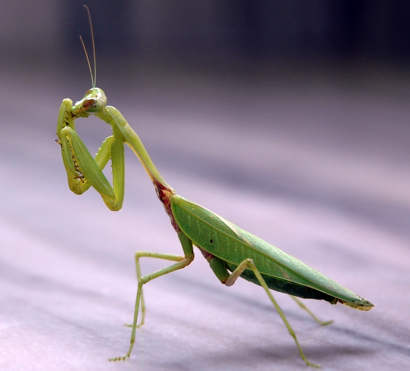
It took me way too long to make this post, but I have my projects from the color unit!  First up is my space picture.

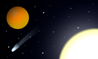
In space, no one can hear you make a reference.
As usual, I'm pretty happy with how this one came out.  All the effects worked as I wanted them too, including the comet I added in there.  If I did this project over, I'd probably make the more solid part of the comet match up better with the gradient trail, or vice versa.  The most difficult part of this piece was adjusting the sun so the gradient between white and yellow was just right.  I learned how to create gradients with Photoshop in this project.

Next is the....um....black and white to color project?  I dunno how to describe it, so here's the picture.

 
Yes, that's Bruce Lee.
This isn't my best work, but I still think it's ok. The red part on the foot didn't quite work as I wanted it to, but it's fine.  If I did the project over, I would make the red part a separate, non-blurred layer that would look more detailed.  The most difficult part was adjusting the blending to be as I wanted it to be.  In doing this project, I learned about how to add color to a purely black-and-white image.

Thirdly is my color wheel.

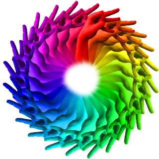
It's not a gang sign.  It's just a thing I did with my hands.  I swear.
I'd say this is one of my best projects, even though it's really simple.  Almost everything worked, but I apparently forgot one 15-degree interval in rotating the hands.  If I could re-do this project, I'd be more careful with the rotations.  The most difficult part was manually rotating the hands so that they matched up, which I learn could've been a lot easier if I knew how to change the point of rotation.  Doing this project taught me how to use colorizing.

Finally, we have my paint splat project, for which I edited a flamethrower into a paint-thrower.

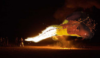
At least it doesn't have any lead in it.
Despite the fact that it looks like bad CGI from a Spy Kids movie, I think I did pretty good on it.  A lot of the removal of the background worked, especially when I started using the magic wand tool.  If I re-did the project, I....honestly don't think there's anything I'd change.  The most difficult part of this project was arranging the paint splats so they covered the fire enough.  This project taught me various tools to remove backgrounds, as well as patience.

That's about it!  When I get all my recolor pictures gathered, I'll be making a post for those too!

Friday, February 3, 2012

Patterned Animals and a Newimal

I have three new pictures!  One is an assigned project, the splatphant.

When he grew older, Dumbo tried out painting.  It didn't work so well.
I think this piece looks good.  It's definitely successful since it looks like it's supposed to, and everything worked as it was supposed to.  If I were to do it over, though, I'd probably fiddle around with the paint layer a little more to make it look more natural.  The most difficult part of this piece was erasing the paint just enough so that nothing went off the elephant.  In doing this piece, I learned how to manage different layer modes and what they do, specifically the darken mode.

I used my new knowledge of layer modes to create an extra piece, the shocktopus.

Wait....wouldn't that be dangerous to everything in the water?
I like this piece more than the splatphant.  The effect looks a lot more realistic than the paint effect on the splatphant, and it looks a lot more successful.  Again, everything that I did worked the way I wanted it to.  I honestly don't think I'd make any changes to this project if I were to do it again.  The most difficult part about completing this piece was finding a good layer mode to get the removal I wanted.  After I was finished, I had learned that the screen mode was best for something like this, as it removed the black and smoothly transitioned into the lightning.

Last but not least is my newimal, the giraffestrich!

So majestic....so beautiful....so pin-headed.

I'm really proud of how I did on this piece.  It looks pretty nice.  I think I succeeded in making a nice, semi-natural looking picture on this one.  As usual, everything worked the way I wanted to, which is a relief.  I thought this project would be more difficult.  However, if I was to do it over again, I'd fix one spot in the neck that looks a little blurry.  The most difficult part of this piece was going back to the original giraffe picture I used the clone stamp on and covering the ostrich's neck and legs.  I enjoyed this piece, as it allowed me to learn how to apply everything I had learned to one image.

That's it for now.

Monday, January 30, 2012

My First Stuff

Hello!  Here's my first stuff from my computer art class.

First up, my evil pancakes picture.

The only pancakes that think you look good enough to eat, even if the feeling isn't reciprocated.
I'm really pleased with the final piece.  I think that it looks good and was really successful overall.  The elements of my own design- the "bloody" syrup and the berries in its mouth- worked well, as did the blueberry eyes, and there really wasn't anything that didn't work about this picture.  If I could do the project over, I'd probably consider softening the edges around the blueberry eyes.  The most difficult part of completing this piece was deciding how much to distort the pancakes by to get a good-sized mouth.  I learned how to use the liquify tool from this piece.

Next is my frog tongue picture.

"You've got a little something on your....uh....never mind...."
I think this piece looks pretty good.  It was fairly successful, and many of the things I did worked.  I did have some occasional trouble with the clone stamp tool, though.  If I did the project over again, I would adjust the drop shadow more, soften the edge where the "tongue" touches the lips, and make it so that the part where the tongue gets slightly narrower didn't occur.  The most difficult part of this piece was going back and manually softening the edges of the frog so it seems more natural.  In doing this project, I learned how to use the clone stamp tool.

Finally, my clone project.

As you can see, this piece represents a man's inner conflict with himself....or maybe it was just fun to make.
This was a really fun piece to do.  I think it was pretty successful.  Most of my photos worked overall, but the guys in the background were behind the guys in the mid-ground, so I had to reposition them.  If I were to do this project over again, I would have more shots in there- that is, if I had more time than I was allowed to do so.  The most difficult part about completing this piece was making sure the shadows blended well, since I would often not erase enough from the picture or would mess up on it.  From this project, I learned how to erase parts of pictures so other ones showed through.